
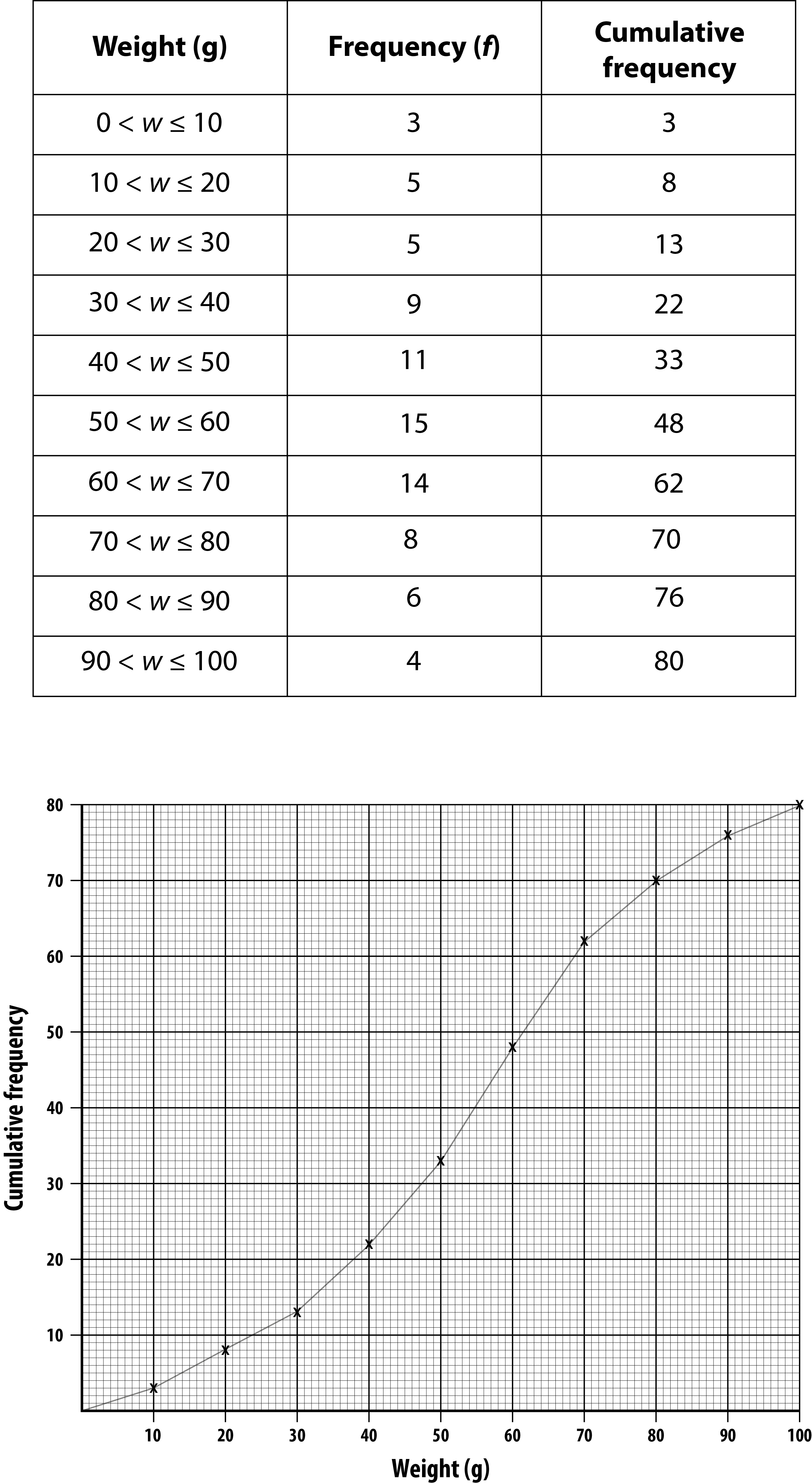
cumulative frequency diagram
A cumulative frequency diagram is a graph which is used to find an estimate of the median, the lower quartile and the upper quartile in grouped data.
The cumulative frequency is plotted, and then all the points are joined together by a continuous straight line or curve.
Below is an example.
Once a week, a pet shop owner weighs the 80 mice which he has for sale. The table shows their weights.
Cumulative means to add, therefore a cumulative frequency diagram needs a running total of the frequency. This is also shown in the table, in the ‘Cumulative frequency’ column.
We can now plot the cumulative frequency on the graph. We must make sure that we use the top end of the class to plot the points, which is the end of each class interval. This must be done because we aren’t sure where in the class interval, for example 0 < w ≤ 10, the values are. What we do know, is that there will be 3 pieces of data by the end of the class interval.
We can see that 62 mice weigh 70 g or less.