
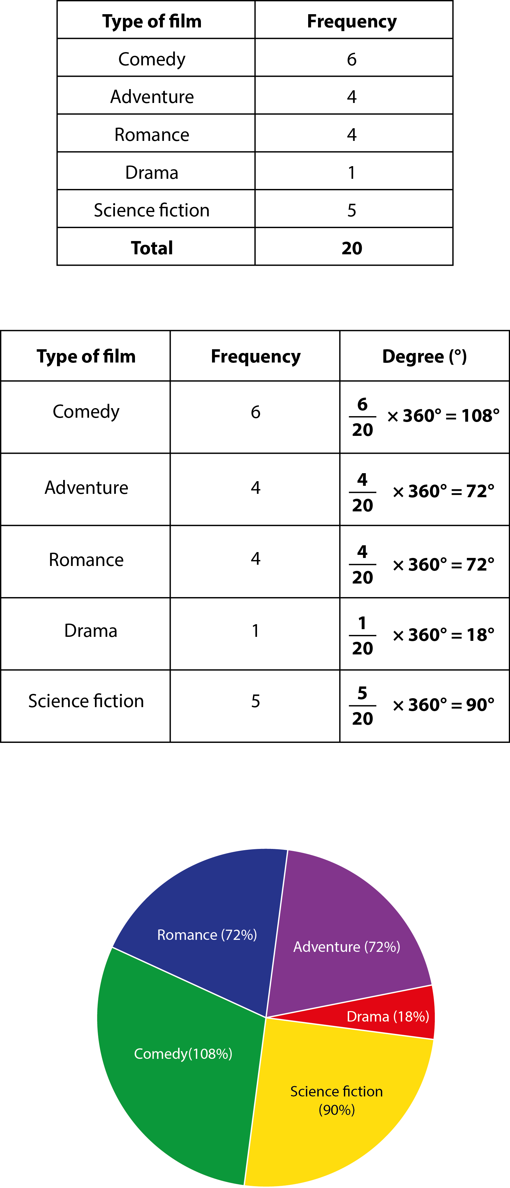
pie chart
This is the name given to one possible form of presenting statistical information.
It’s a chart in the shape of a circle, divided into sectors. Each sector represents the relative size of each value.
For example, you have conducted a survey to find out what type of film your friends like.
The first table shows the results.
To show these results in the form of a pie chart, we have to calculate the angle for each sector. Remembering that there are 360° in a circle, we divide each frequency by the total number of friends, and then multiply by 360°. This is shown in the second table.
Now, you have the necessary information to draw the pie chart.